notes on the language of colour: choosing colours for your wedding and beyond
One of the questions my clients ask me most often when designing wedding stationery is: how do I choose a colour palette for my wedding invitations?
Helping to refine a colour palette is one of my favourite parts of the process - sitting with my paper samples, my swatch books, and stacks of envelopes, to create perfect combinations of colours. Some couples come to me with an exact colour palette picked out, right down to the name of the Pantone shade. But often couples don’t know where to begin on colour - and this is why I have written this piece.
When I am commissioned to create a couple’s wedding invitations, this is the system I use to help them identify colours. I show them the colour chart I have created, and ask them to tell me which groups of colour they lean towards. We have then a few colours, or at least a group of tones and hues, that we can start working from.
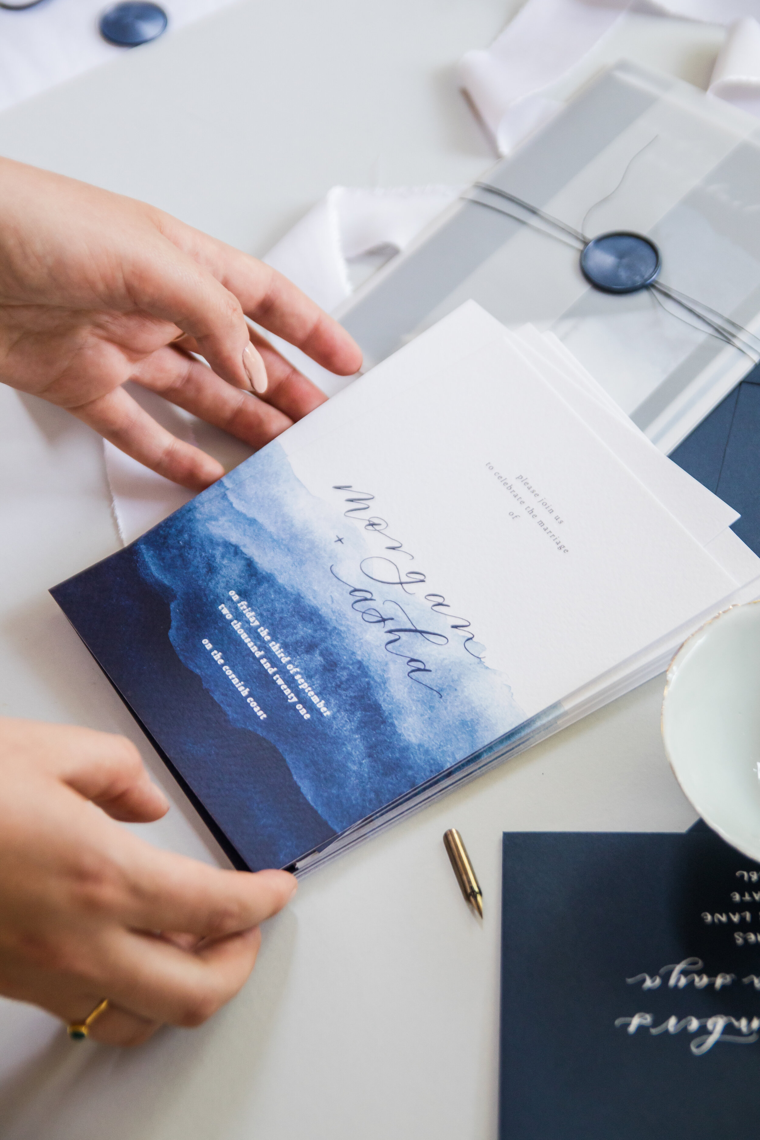
First we have warm colours (reds, oranges, yellows) and cool (blues, green, purples). And then I have grouped them into their saturation (how pure the colour is vs. tones of grey), and their intensity (light vs. dark).
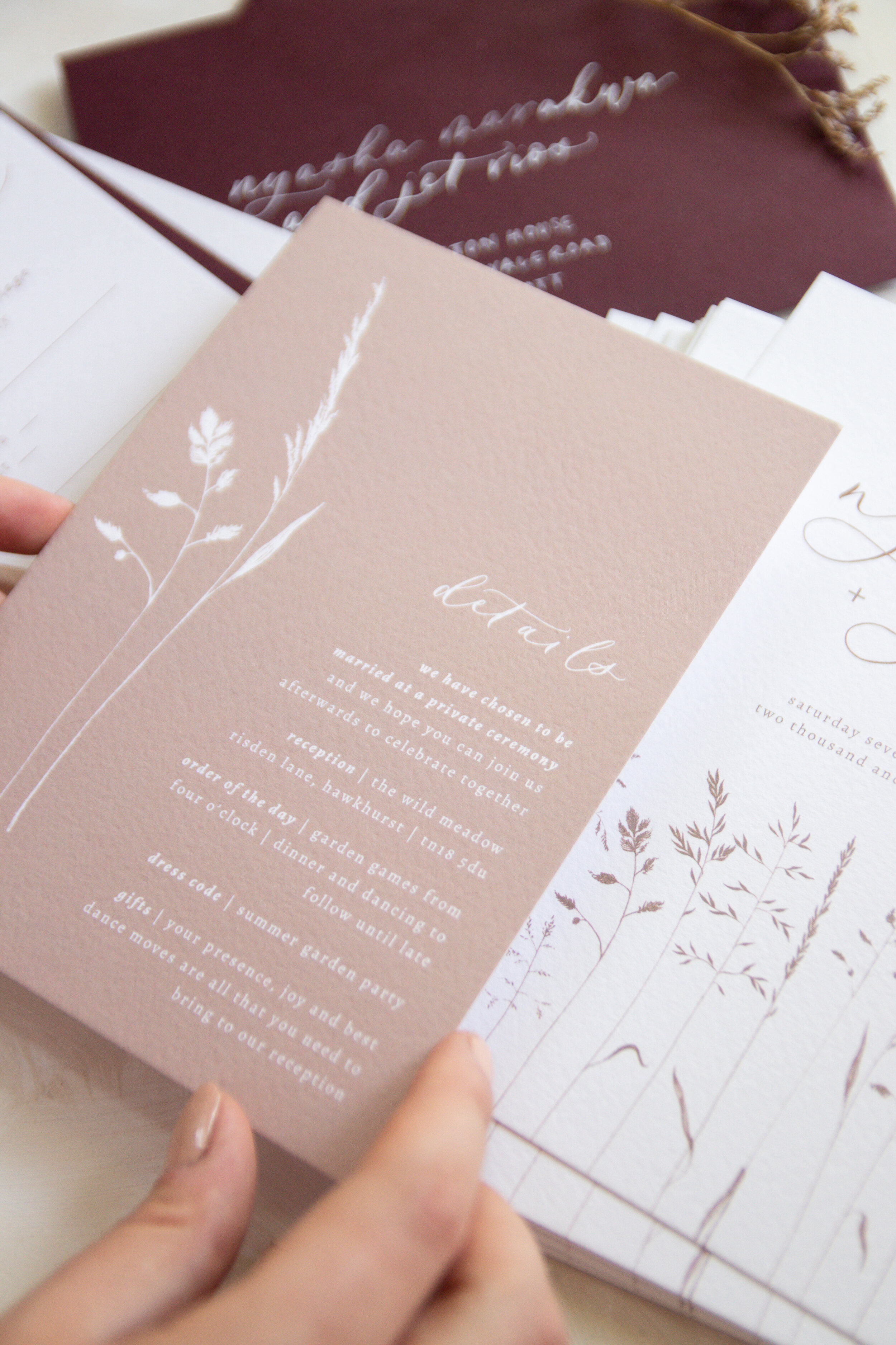
earth tones | dark, unsaturated

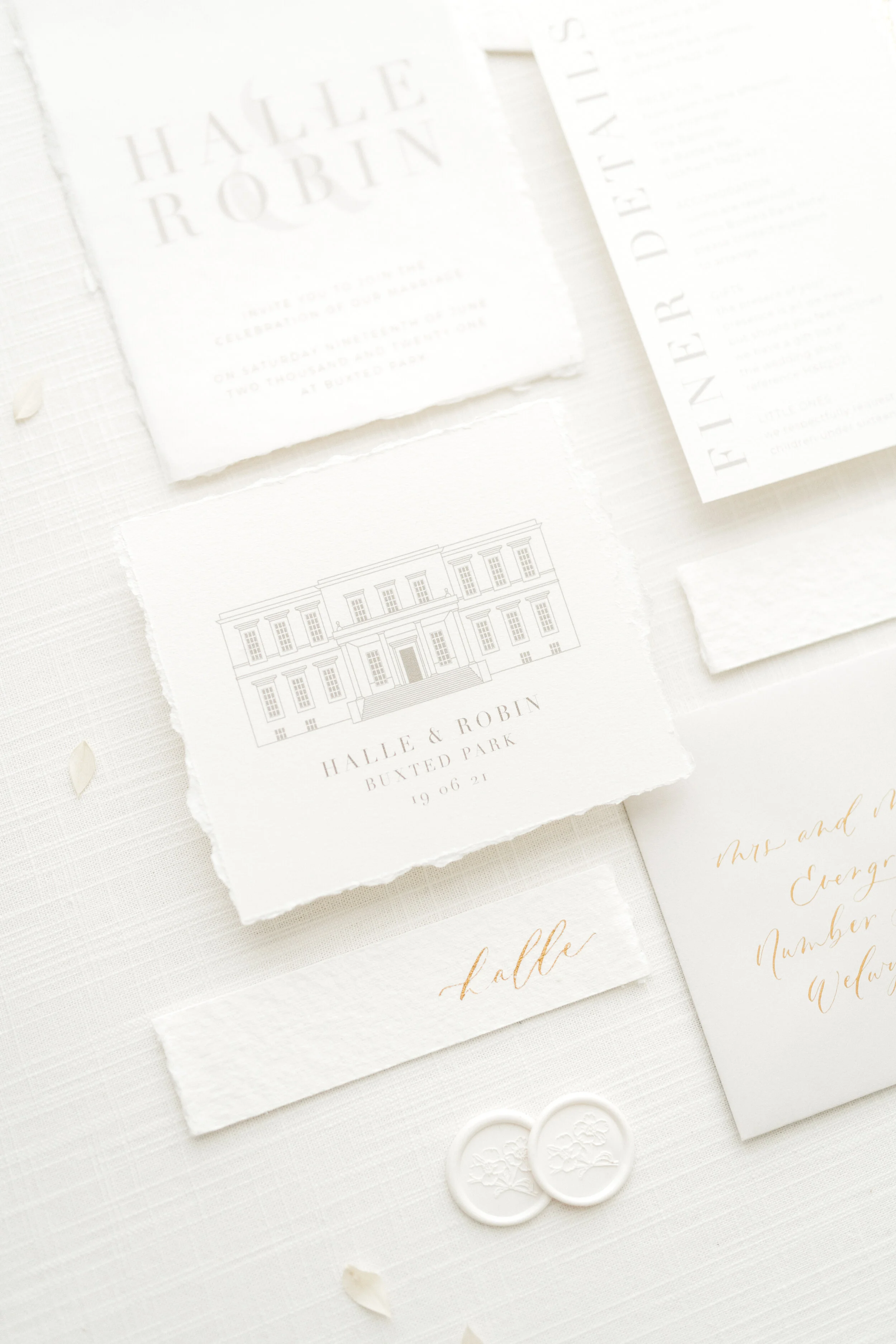
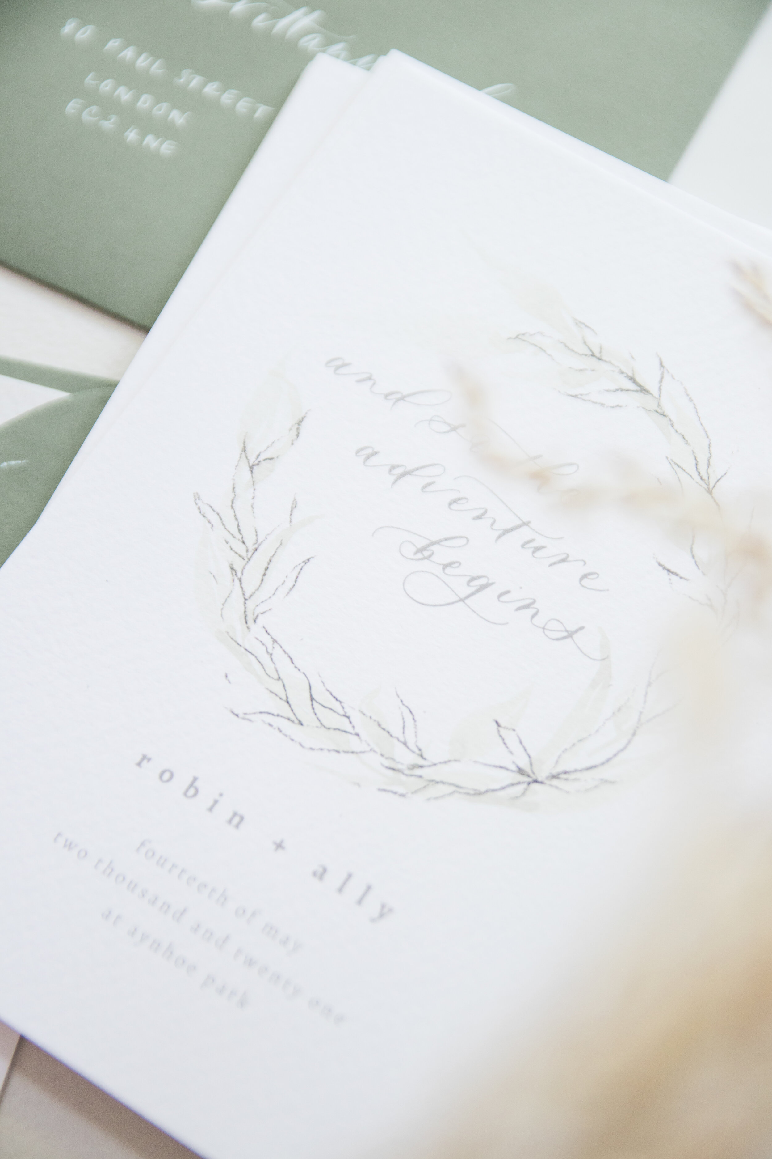
neutral tones | light, unsaturated

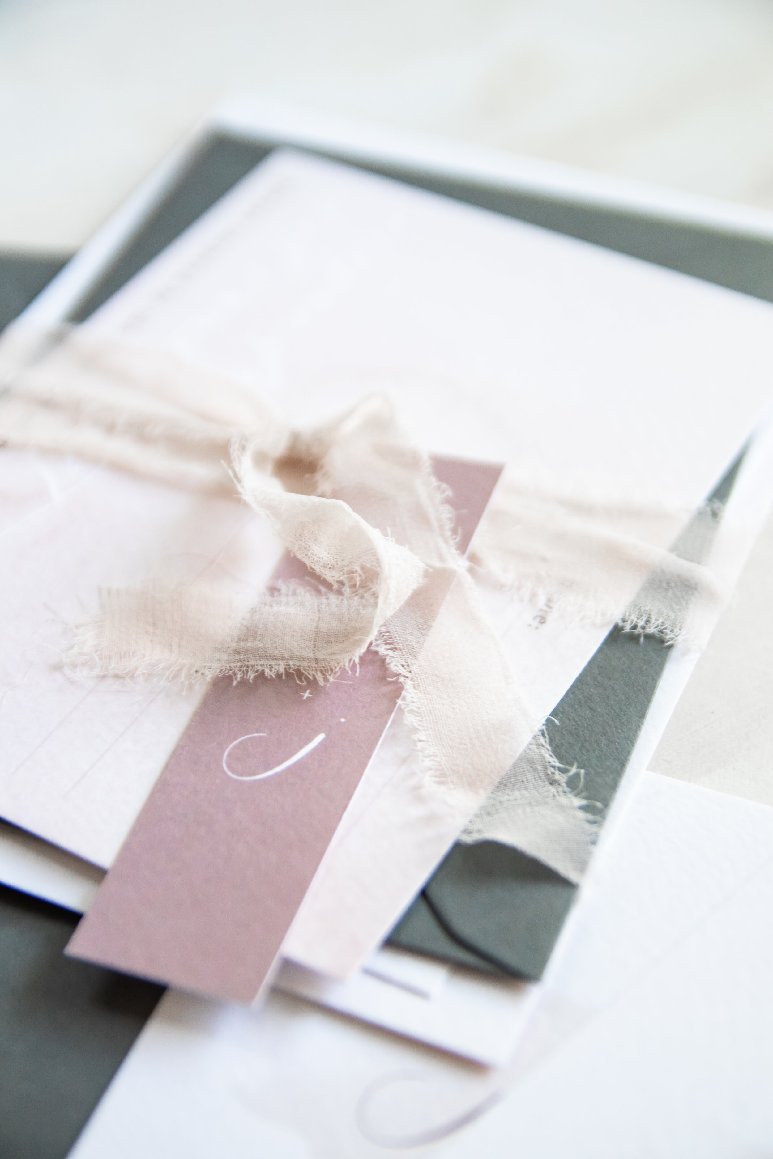
pastel tones | light, saturated
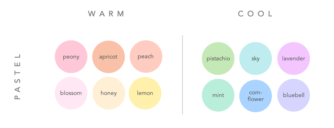
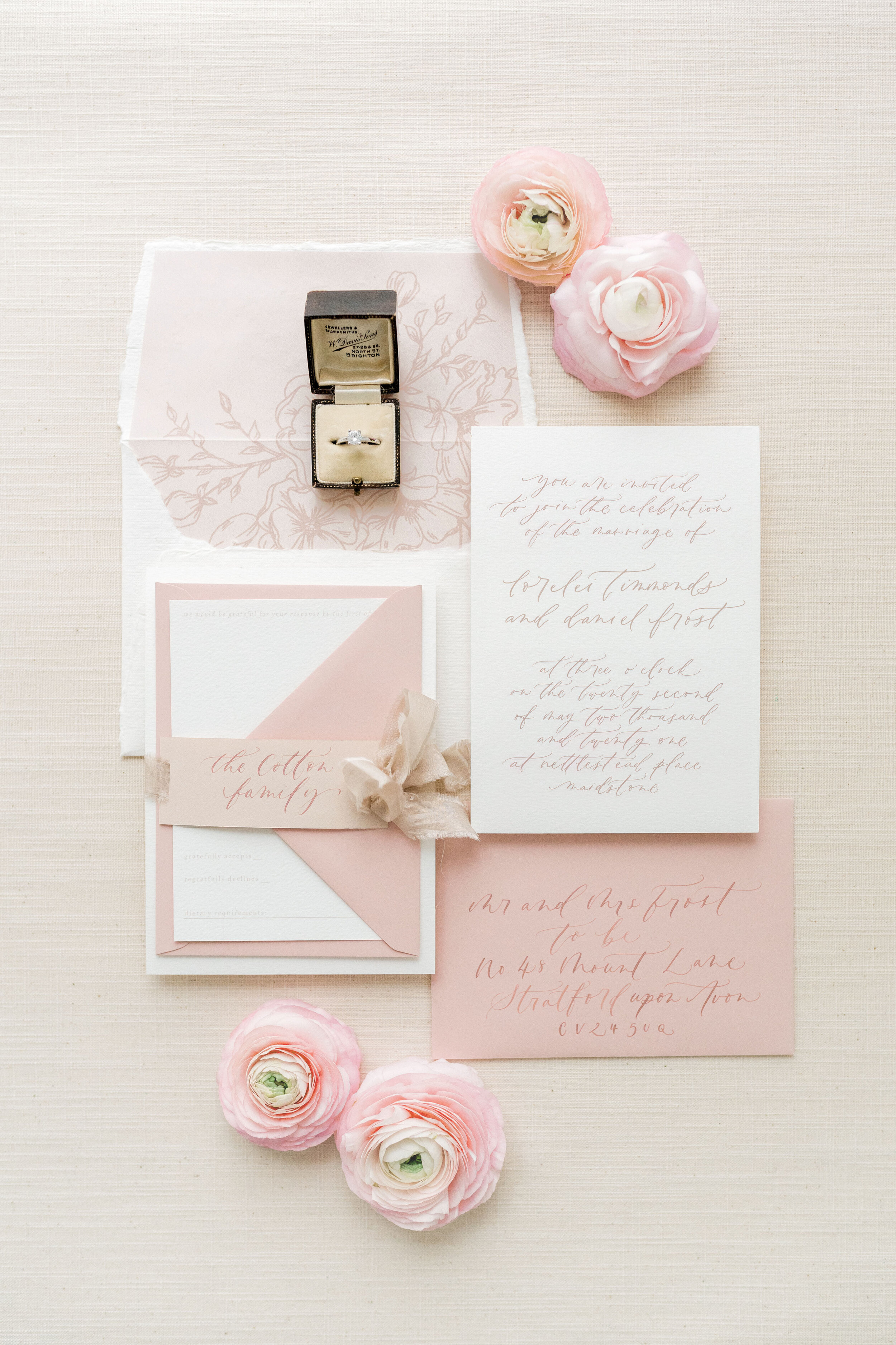
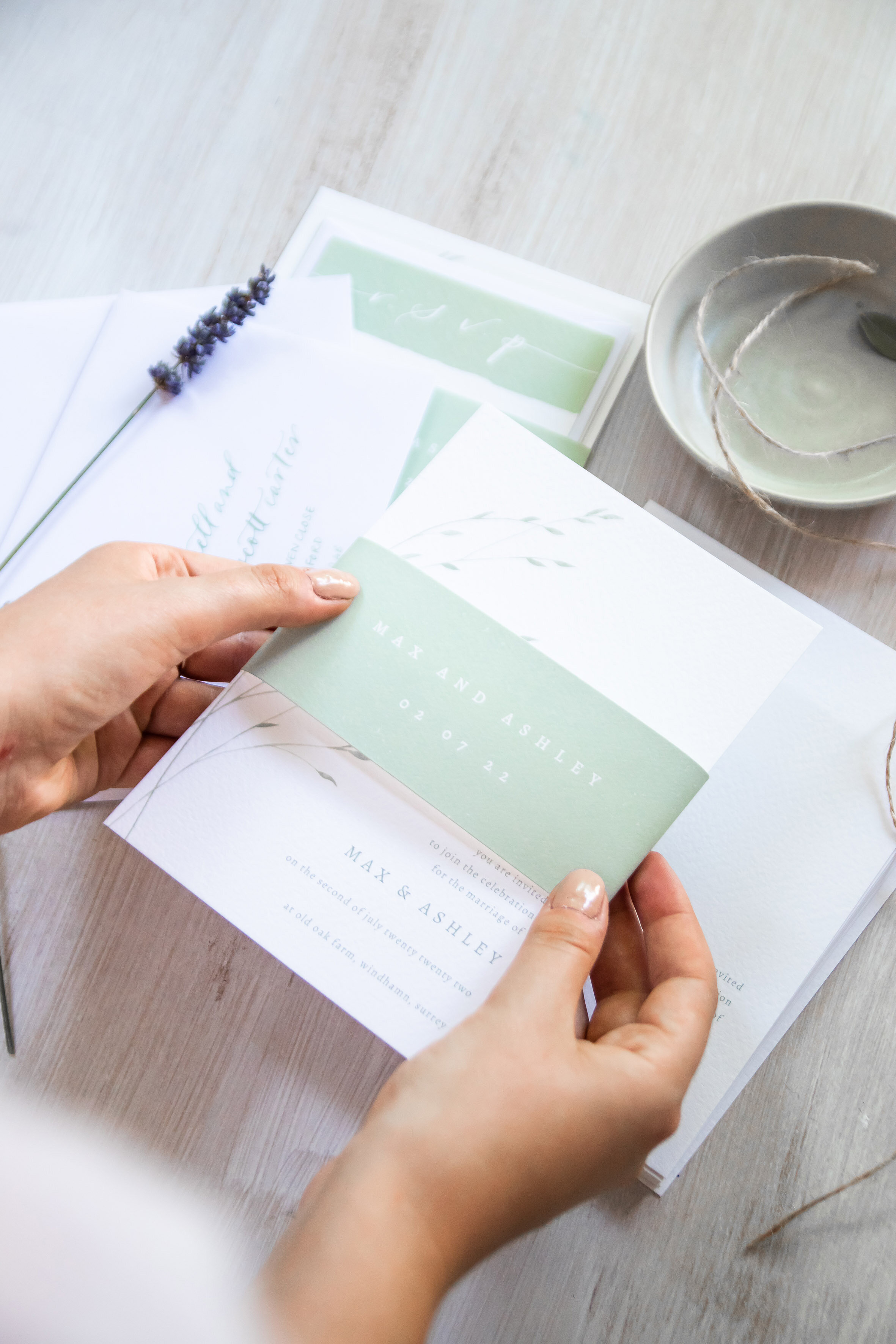
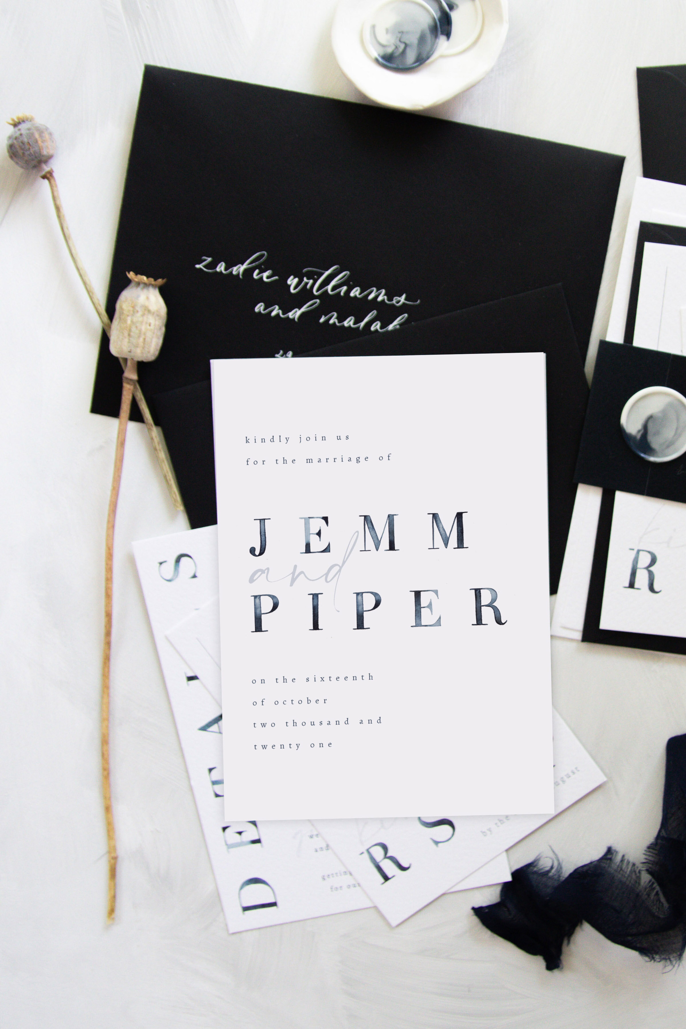
jewel tones | dark, saturated

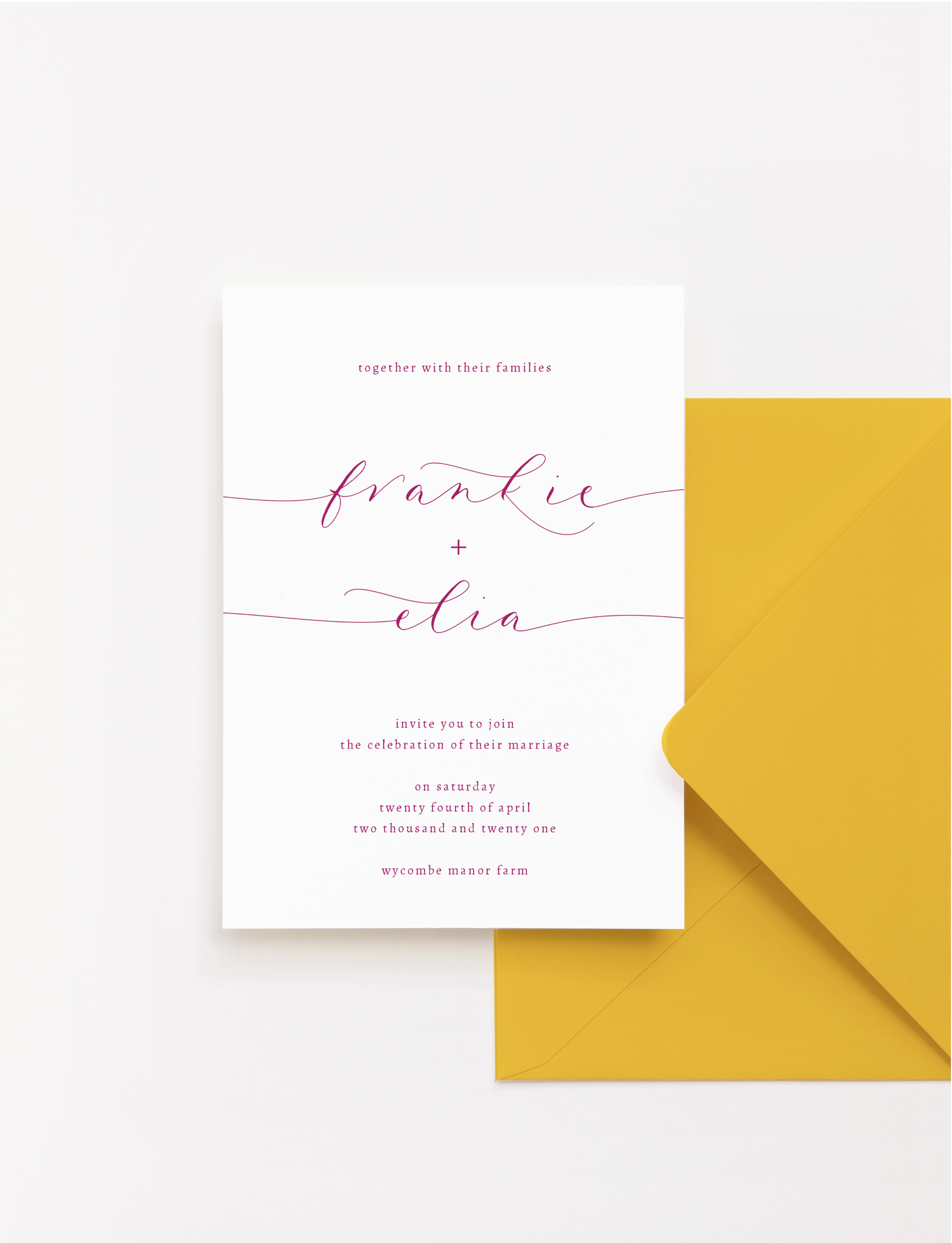
warm & jewel | bright pink and yellow wedding invitations in my FLOURISH design
cool & jewel | navy blue wedding invitations in my TIDE design
customising your wedding invitations
Whether you choose one of my ready to go designs from the collection, or you opt for a bespoke invitation suite design, we can start with this colour chart and use it to refine specific colours and mix and match them. I recommend having at least three complementary colours or shades for your invitations: one main colour which will be based off the envelope shades I use; one contrasting accent colour; and one neutral colour.
While each invitation suite in the collection has been styled in a specific colour palette with matching envelopes, all designs are tailored to your day and can be customised. From there we can add wax seals, ribbons, thread, in colours that work with the rest of the palette. You can find out more about this process and the options available here.
click here to download your step-by-step wedding stationery planner
timeline | templates | budgets + a whole heap of honest advice